10-Minute Button Monogram Letter Art (The Three-Size Fill Rule)
I have had the same jar of buttons for nineteen years. It started as my mother’s, it lives on the shelf above the craft table, and until two summers ago its entire purpose was to sit there looking charming and be moved when I needed the shelf.
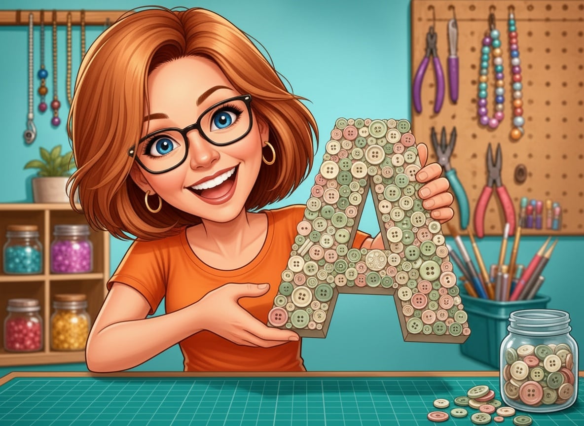
Then my niece was packing for her first year away, and I wanted to send something up with her that wasn’t a mug. I had one evening and a papier-mâché letter I’d bought for a project I never started. So I glued buttons to it. The first attempt was terrible. I’d worked in neat rows and it looked like a spreadsheet. I pulled them off while the glue was still soft, started again with the biggest buttons first, and forty minutes later I understood something that has made every button project since take ten minutes instead of one.
She hung it over her desk. Her roommate asked where she bought it.
Why a button monogram is worth your ten minutes
A button monogram is one letter, an initial, with its whole front face covered in buttons. That’s the entire project. No sewing, no paint drying, no tools you’d have to go out and buy.
What makes it worth doing is the range. The same ten minutes gives you a dorm-room wall piece, a nursery name letter, a teacher’s classroom door hanger, a wedding table marker, or a shelf piece spelling out a family initial. Change the button colours and it changes character completely: soft creams and pearls read like a nursery, brights read like a kids’ room, all-white on white reads like something from a boutique.
And it costs almost nothing if you already have the jar. Most of us have the jar.
What you’ll need
- A blank letter. Papier-mâché or wood, eight to twelve inches. Eight inches is the sweet spot, big enough to be a real wall piece, small enough that you’re not still gluing at midnight. Papier-mâché is lighter and takes glue better; wood is sturdier if it’s going somewhere it might get knocked. (papier-mâché craft letters)
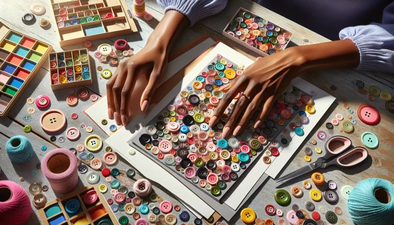
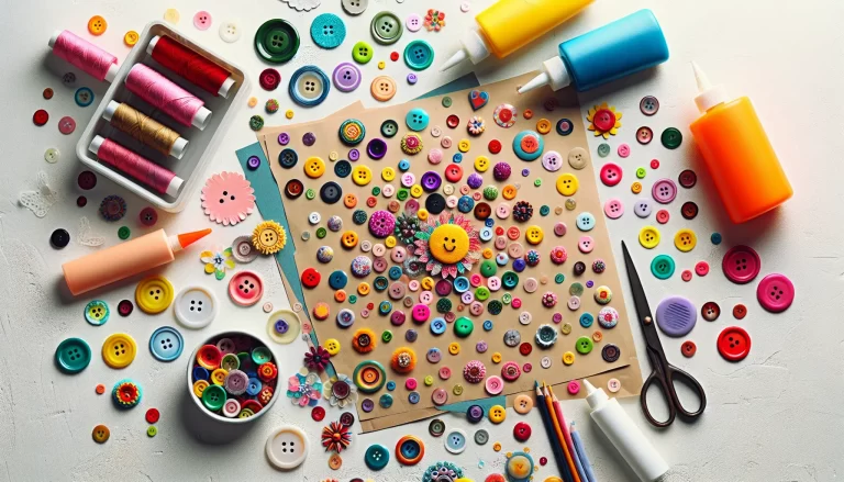
- Buttons, in a mix of sizes. This is the part that matters most, and I’ll explain why in a moment. You want big, medium and small in the same batch, not a bag of forty identical buttons. A mixed assortment jar is the right buy here even if you have a button stash, because most stashes are heavy on medium and short on the big anchor buttons. (assorted mixed-size craft buttons)
- Tacky craft glue. Not hot glue. I know hot glue is faster and I use it for nearly everything else, but on buttons it beads up under the rim and dries in visible shiny lumps, and you get about four seconds to place each one. Tacky glue grabs in twenty seconds and lets you nudge. (fast-grab tacky craft glue)
- Craft paint in your base colour. One coat, and you only need it on the edges and any gaps. More on this below, because it’s the five-minute step that makes the difference between “handmade” and “bought”. (matte acrylic craft paint)
- A toothpick or skewer. For nudging buttons into place and pushing tiny ones into gaps without gluing your fingers together. You have one of these already.
The three-size fill rule
Here is the whole secret, and it’s the reason my first attempt looked like a spreadsheet and every one since has looked like a shop piece.
Glue your buttons on in three passes, biggest first.
Pass one, the big buttons. Take your largest buttons, the ones over about three-quarters of an inch, and scatter them across the letter. Not in rows. Not evenly. Spread them out so no two big ones are touching, and let them fall wherever they land, some near the edge and some in the middle. On an eight-inch letter that’s usually six to ten buttons. This pass takes ninety seconds and it does all the composition work for you.
Pass two, the mediums. Now fill the wide-open spaces between the big ones. Mediums are your workhorse, and this is where most of the surface gets covered. Keep letting them touch each other and touch the big ones. Don’t measure anything.
Pass three, the tiny ones. Every gap left is now small and awkwardly shaped, which is exactly what tiny buttons are for. Push them in with the toothpick. Stack a small one on top of a big one here and there for depth. This pass is the one that makes people ask where you bought it.
The reason it works is that a random scatter of one size reads as a mistake, but a deliberate hierarchy of three sizes reads as design. Your eye lands on the big buttons first, follows them around the letter, and never notices that nothing was planned. If you glue in rows, or if you use all one size, the eye has nowhere to go and it just sees a grid.
How to make one, start to finish
1. Paint the letter first. Pick a colour that matches your busiest button colour, not a contrast. Do the edges and give the front face a quick coat too. Let it dry while you sort buttons. This is the step people skip, and it’s the one that makes gaps look intentional instead of unfinished, because every sliver of letter showing between buttons now looks like part of the piece.
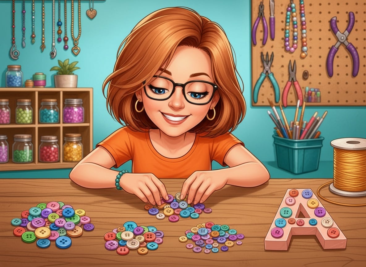
2. Sort into three piles. Big, medium, tiny. Do this on the table before you open the glue, and be honest about the piles. If your “big” pile has three buttons in it, go raid a coat. Two minutes here saves you hunting mid-project with glue on your fingers.
3. Dry-lay the big ones. Set your big buttons on the letter with no glue at all. Look at it. Move any two that are crowding each other. When it looks scattered rather than arranged, you’re ready.
4. Glue in the three passes. A dot of tacky glue in the centre of the letter, not on the button, then press the button on and hold for a slow count of five. Work big, then medium, then tiny. Don’t tip the letter until the whole thing has sat flat for an hour.
5. Check it from across the room. Stand back six feet. Any spot that reads as a hole gets one more tiny button. Any spot that reads as a lump has too many stacked. Six feet is the honest distance. Up close you’ll fuss forever.
The mistakes I made so you don’t have to
Working in rows. My spreadsheet letter. Buttons in lines look like a chart, and no amount of pretty colours saves it. Scatter is the point.
Using hot glue. The lumps show under the button rims forever, and on a shank button (the ones with a loop on the back instead of holes) hot glue cools before the shank settles and the button sits crooked. Tacky glue and patience.
Not painting first. A white letter under mixed buttons shows every gap as a bright flash. Paint it to match and the same gaps disappear.
Sorting by colour instead of size. Very tempting, and backwards. Size is what builds the composition. Colour just needs to be roughly in a family, so pick two or three shades plus a neutral and stop there.
Filling the counters. The enclosed holes in letters like A, B, O and R are called counters, and they should stay empty. Buttons around them, nothing in them, or the letter stops being readable.
Letters that are easier, and letters that fight you
If it’s your first one, a straight-sided letter is kinder: L, T, I, E, H, F. Wide, open strokes, nothing to work around.
Curves are next: C, S, O, G. Your big buttons want to hang off the outside edge on a curve, so keep them just inside the line and let mediums do the edge work.
The awkward ones are X, K, V and W, where strokes meet at sharp points. Put a big button right on the junction where the strokes cross, and work outward from it. That one button covers the messiest part of the shape and turns it into a feature.
Ways to use them
A single initial over a desk or bed. A child’s whole first name in smaller letters along a nursery shelf. A monogram propped on a bookcase between the books. Teacher gifts at the start of term, which is when I make most of mine. Wedding table letters. And the one that surprised me: a spare initial glued to a plain gift box lid, which turns wrapping into part of the present.
They post well too, because papier-mâché weighs almost nothing and buttons that have sat flat for a full day don’t budge in transit.
Grab the free button placement guide
The three-size rule is easy to hold in your head until you’re actually sitting there with the glue open, so I put it on paper. The free Button Monogram Placement Guide is a one-page printable with the three-pass fill diagram showing what each pass looks like on a real letter, a size-sorting chart so you know how many big, medium and tiny buttons an eight, ten or twelve-inch letter actually needs, and the letter-shape cheat sheet marking which strokes to anchor and which counters to leave open.
Print it, prop it against the button jar, and you’ll only need it for the first letter. After that the three passes are just how you do buttons.
Happy crafting, and remember: if it looks a bit random, you’ve got it exactly right.