
10-Minute Mini Wood Shelf Signs: The Character-Count Rule That Stops Your Last Word Crashing Into the Edge
I want to tell you about the sign that ran out of room. It was a little wood plaque, five and a half inches across, and I was lettering GATHERING PLACE on it in black paint pen for the shelf above my kitchen sink. I started at the left edge the way you do. GATHERI came out beautifully. Then I looked at how much board was left, and how much word was left, and the two numbers did not agree at all.
You know exactly what happened next, because you have done it too. The last letters got narrower and narrower and closer and closer together until PLACE was crammed into the corner like it was trying to get out of the frame. I sanded it back and did it again. Same thing. The word was not too long. I was just finding out how long it was in the wrong order, at the wrong end of the board, when it was already too late to do anything about it.
What we are making
A small wood shelf sign, hand lettered with a paint pen, where the words are centered and evenly spaced and reach comfortably across the board without touching the edges. No stencils, no vinyl, no cutting machine, no transfer paper. Just a plaque, a pen, a pencil and a ruler.
The clock on this one is honest: about ten minutes, and most of that is the lettering itself. There is no drying day hiding at the end — a paint pen is touch dry in a couple of minutes. What there is instead is one minute of planning at the start, and that minute is the whole article.
Why your last word crashed into the edge
Here is the part nobody tells you. When you letter left to right, you are spending board width you have not counted. Every letter is a withdrawal, and you do not find out the balance until the account is empty. By the time the board tells you the word was too long, you have already committed the first two-thirds of it.
So the fix is not neater lettering or a steadier hand. Mine were both fine. The fix is finding out the answer before you uncap the pen, and it turns out you can, because two things about a board are knowable in advance: how much of it you are allowed to letter on, and how much of it one letter eats.
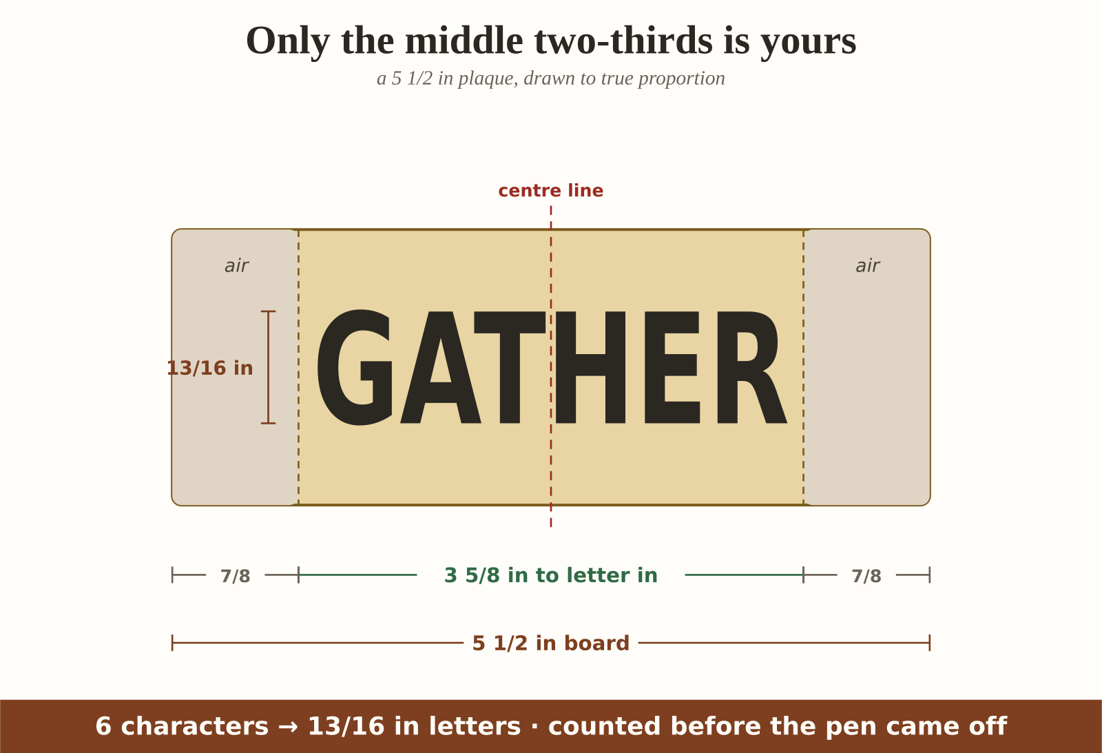
How much you are allowed to letter on. Not the whole board. A sign wants air around the words or it reads as cramped no matter how well it is lettered. Keep the lettering inside the middle two-thirds of the width and leave a sixth of the board empty at each end. On my five-and-a-half-inch plaque that is 3 5/8 inches to letter in, with 7/8 of an inch of quiet at each side.
How much one letter eats. This is the number I had never thought about. A capital letter is not just as wide as it is tall — it is a bit narrower, but then it needs a gap after it before the next one. Letter plus gap, together, runs about seven tenths of the letter’s height. A one-inch-tall capital costs you about seven tenths of an inch of board, all in.
Put those two together and the whole problem collapses into one line of arithmetic.
The character-count rule
It fits on one line, and you read it in whichever direction you need.
Count the characters. Your letter height is the lettering width, divided by the character count, divided by seven tenths.
Or backwards, when you already know what pen you are using: the number of characters that fit is the lettering width divided by seven tenths of your letter height.
Two things to say about counting, and both of them go the safe way on purpose. Count every character, spaces included — a space is narrower than a letter, so counting it as a full one buys you a little margin rather than spending one. And that seven tenths is a planning figure, not a measurement of your handwriting. It runs a touch generous, so if it is wrong for your pen it is wrong in the direction of a bit more space at the ends, which nobody has ever complained about.
GATHER is six characters. Six characters on my 3 5/8 inches of lettering width comes out at 13/16 of an inch tall. Not roughly. Thirteen sixteenths, and it fits, and it is centered, and I knew all of that while the cap was still on the pen.
The chart for a 5 1/2 inch plaque
Every number here comes straight out of that one line, so you never have to do the arithmetic standing at the table.
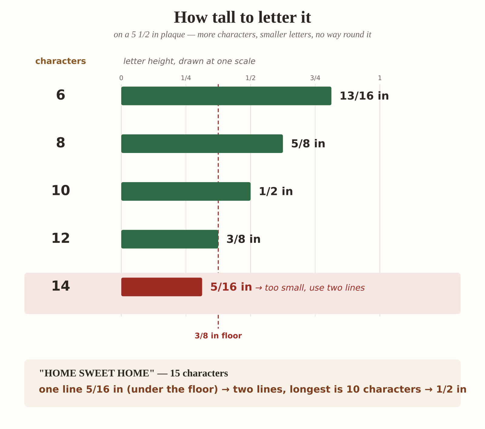
- 6 characters → letter them 13/16 in tall
- 8 characters → letter them 5/8 in tall
- 10 characters → letter them 1/2 in tall
- 12 characters → letter them 3/8 in tall
- 14 characters → letter them 5/16 in tall — and this is where you stop, which I will come back to
I have rounded every one of those down to the nearest sixteenth, and down is deliberate. Rounding up would spend width the board has not got, which is the exact thing we are here to stop. Rounding down leaves you a little air at the ends. If your finished sign has slightly more breathing room than you planned, the rule worked.
Every board on the rack
Craft stores stock small plaques in a handful of widths, so here is the other way round: pick the comfortable half-inch capital, and this is how many characters each board will take.
- 4 in board → 2 5/8 in to letter in → 7 characters
- 5 in board → 3 5/16 in → 9 characters
- 5 1/2 in board → 3 5/8 in → 10 characters
- 6 in board → 4 in → 11 characters
- 7 in board → 4 5/8 in → 13 characters
- 8 in board → 5 5/16 in → 15 characters
This is the list I now read in the shop, before I buy the board. WELCOME is seven characters, so a four-inch plaque will just take it at half-inch capitals. HOME SWEET HOME is fifteen, so it needs the eight-inch board, or it needs two lines. Deciding that at the rack costs nothing. Deciding it halfway through lettering costs you the plaque.
Now letter it from the middle out
The number tells you it will fit. This is the bit that makes it land centered, and it is the habit I had to break: do not start at the left edge. Start in the middle and work outwards in both directions.
- Find the centre of the board and rule a light vertical pencil line down it. Rule a horizontal one for the baseline too, so your letters sit on something.
- Count your characters and read the letter height off the chart. Mark that height above the baseline with two little pencil ticks, so you have a top line as well as a bottom one.
- Find the middle character of your word. Odd number of characters and the middle one sits astride the centre line; even number and the centre line falls in the gap between the two middle ones.
- Letter that middle character first, then work outwards — one to the left, one to the right, one to the left — alternating until you reach both ends.
- Let it dry a couple of minutes, then rub the pencil lines away with a soft eraser.
Alternating outwards is what keeps it honest. Any small error in your spacing gets shared out to both ends instead of piling up at the right-hand one, so the word stays centred even when your letters are not perfectly even. And they will not be perfectly even. That is fine. It is a handmade sign, and slightly irregular letters that are centred read as charming, while perfectly even letters that are off-centre read as a mistake.
When to break it into two lines
Look back at the chart and you will see it run out. Fourteen characters on a five-and-a-half-inch plaque gets you letters 5/16 of an inch tall, and that is where I draw the line — below 3/8 of an inch, a shelf sign stops reading as a sign. It becomes small print. You can still read it, but only if you walk up to it, and a sign that has to be approached is not doing its job.
So when the chart says smaller than 3/8, go to two lines. The rule still does all the work, with one change: size to the longer line.
HOME SWEET HOME, fifteen characters, is 5/16 in on one line, which is too small. Break it at the middle space and you get HOME SWEET over HOME. The longer line is HOME SWEET, ten characters, and ten characters is half an inch. So two lines take that sign from unreadable small print to comfortable half-inch capitals, on the same board, with no other change.
And it works even when one line would have been fine. LET IT BE is nine characters, 9/16 of an inch, perfectly good. Break it to LET IT over BE and the longest line is five characters, which is a full inch tall. Sometimes two lines are not a rescue, they are just a bigger, bolder sign.
Ten minutes, honestly
- Count your characters and read the letter height off the chart: 20 seconds.
- Rule the centre line and the baseline in pencil: 60 seconds.
- Tick the letter height and rule the top line: 40 seconds.
- Find your middle character and mark where it starts: 30 seconds.
- Letter from the middle outwards: 300 seconds.
- Let the paint pen dry: 120 seconds.
- Erase the pencil lines: 30 seconds.
That is ten minutes exactly, and the five minutes of lettering is the only part that needs you to concentrate. Everything before it is measuring, and everything after it is waiting.
The wood and the pen, honestly
A few things I learned the expensive way, so you do not have to.
Seal a raw wood plaque before you letter it. Bare wood wicks paint along the grain, and a crisp letter turns into a slightly furry one within a minute. A coat of matte Mod Podge or a spritz of clear sealer, dried, and the pen sits on top where it belongs. If your plaque came already painted or stained you can skip this entirely, which is most of why I buy them that way.
Shake and prime the paint pen on scrap first. Every paint pen floods on its first stroke. If that first stroke is the middle letter of your sign, you have just put a blob at the exact centre of the board. Prime it on a bit of card until it flows evenly, then start.
Use a bullet tip, not a chisel tip. A chisel tip gives you gorgeous thick-and-thin strokes if you already letter well, and gives you wildly inconsistent letter widths if you do not — which breaks the seven-tenths figure the whole chart is built on. A bullet tip draws the same width in every direction, so what you planned is what you get.
Pencil lines want to be light. Press hard on sealed wood and the groove stays after the graphite is gone. Barely-there lines erase completely.
If yours still is not right
It fits but it looks cramped. Check your side margins rather than your letters. If your lettering is running into the outer sixth of the board, you have used the whole width instead of the middle two-thirds — the letters are fine, the air is missing.
It came out narrower than the chart said. Your gaps are probably tighter than seven tenths, which honestly is a nice problem: you have room for a slightly taller letter next time. Measure your finished word, divide by the character count, divide by your letter height, and you will have your own personal number to use instead of mine.
It drifted off centre anyway. You lettered outwards from the middle in one direction before doing the other. Alternate — left, right, left, right — so the two halves grow together.
The second line looks wrong under the first. Two lines want to be centred on the same centre line, not left-aligned with each other. The pencil line you already ruled does both.
What you need
Some of the links below are affiliate links. If you buy through one, Crafting With Donna may earn a small commission at no extra cost to you.
- Small wood plaques, the 5 1/2 in size is the one every example here uses
- Bullet-tip paint pens, medium point, not chisel
- A 6 in clear ruler, for finding the centre and ticking letter heights
- Matte Mod Podge, to seal raw wood so the pen stays crisp
- A soft vinyl eraser, for lifting pencil lines off a sealed board
- Small sawtooth hangers, if yours is going on a wall rather than a shelf
Get the free layout guide
I made you the sheet I wanted on the evening of GATHERING PLACE. It carries the letter heights printed at true size, so you can hold your plaque against the paper and see 1/2 an inch rather than guess at it, and there is a 1:1 ruler along the bottom for finding your centre without going to look for a tape measure. Both charts are on it — the character counts for a five-and-a-half-inch board, and the character budget for every board width on the rack — plus the centre-line diagram, so you can copy the layout straight off the page.
Print it at 100% rather than “fit to page”, or the letter-height bars stop being letter heights. The sheet says so across the top, so you cannot forget the way I did.
Keep the ten-minute craft nights coming
If quick wins like this one are your speed, the printable Craft Night Kit Planner from the craft table lays out the supplies, timing, and shopping list for a whole month of ten-minute craft nights — print it once, plan four cozy nights. It’s $7 in the Crafting With Donna shop.